

Creating Great ID’s for Companies and Brands is an Art and a Science.
While the use of Ai makes creating logos and custom typography easier in ways, so much more goes into great Corporate Identities than just a pretty image form. From vector to raster, postage stamp to billboard size, color or black and white, a solid Corporate ID must work in myriad ways. Read on for more!
Creating a powerful Corporate Identity (Corporate ID), with a focus on logos, involves a strategic approach to ensure the logo encapsulates and communicates the essence of the brand effectively. Here are ten best practices:
-
Simplicity is Often Key: A simple logo design is often more memorable and versatile. Avoid clutter by using fewer elements that are meaningful. The principle of “less is more” helps in creating a logo that is easily recognizable and timeless. Some logos however, benefit from a more artistic and “maximalist” approach. It’s up to an experienced designer and the client as to what suits the job best. TIP: Design in black and white first. If the ID works well, it’s easy to add color later.
-
Reflect Brand Values and Story: Your logo should communicate your brand’s identity and values. Incorporate your brand’s personality into the design through strategic choices in symbolism, typography, and color. This storytelling aspect helps in connecting with customers on a deeper level.
-
Ensure Scalability: Your logo must be effective across various sizes—from business cards to billboards. Design it in a vector format to ensure it remains clear and legible when scaled up or down. Test the logo at different sizes to ensure its versatility.
-
Choose Colors Wisely: Color psychology plays a significant role in logo design. Select a color palette that aligns with your brand’s identity and evokes the desired emotional response from your audience. Be mindful of color combinations and their impact on readability and memorability.
-
Typography Matters: The font you choose should reflect your brand’s character. It should be legible at various sizes and in different applications. Consider custom typography for uniqueness or choose from classic, timeless fonts for a professional look. Even if you choose a traditional font, great designers tweak the typeface for maximum originality in logoforms.
-
Be Original: Stand out by avoiding clichés and generic designs. Originality in logo design helps differentiate your brand from competitors. It’s crucial to have a unique logo that isn’t easily confused with others in the market.
-
Versatility: Your logo should work across different media, aspect ratios and backgrounds – both light and dark. Create variations of your logo for different uses, ensuring it maintains its integrity and impact in various contexts. Often, the best ID’s incorporate a logo with a chevron (or icon) that can be used separately when necessary. This works best for businesses with established customer bases, but it doesn’t hurt to keep this in mind, even for new companies and brands.
-
Cultural and Market Relevance: Consider the cultural context of your target market. Symbols, colors, and even typography can have different connotations in different cultures. Ensure your logo resonates with or is at least neutral to the cultural nuances of your audience.
-
Timeless Design: Aim for a design that won’t feel outdated quickly. While trends can be tempting, a logo should ideally be timeless, allowing your brand to evolve without needing a redesign every few years.
-
Gather Feedback and Test: Before finalizing, seek feedback from stakeholders, potential customers, and design professionals. Testing can include showing the logo in different sizes and contexts to ensure it communicates the intended message effectively. Implement changes based on this feedback to refine the design.
By adhering to these best practices, you can create a logo that not only serves as a powerful visual identifier for your brand but also supports a consistent and coherent corporate identity.
Using Ai to Aid in Your Designs
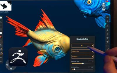
With the Jascos logo we created for our client as an example, we used the Midjourney Ai art generation platform to create images of fish and fish skeletons, and we made numerous ones with bones. The one we ultimately chose, we edited in Adobe Photoshop and Illustrator to get the desired graphic look we were after.

An example of raw output of a fish skeleton from our text prompt to the MidJourney Ai art generator.
This design works great for everything from busieness cards to T-Shirts, and allows us to create color variations and even separate out the custom type elements to use in other promotional and web graphics with different imagery.
Here is an example of just the logo typography as used in a promotional piece that was printed as refrigerator magnets. The uniqueness of the typeforms allows them to be used with or without a fish as the logo, which makes it better for things like website header logos, for example.

Color fridge magnet design. Often the client will want more than fits in the area well, and you just have to go with it.


0 Comments